Chapters
- 0:00 Introduction
- 0:15 This Month's Story
- 0:40 AI Insights & Recommendations
- 1:05 Spending Breakdown by Category
- 1:30 Top & Lowest Spending
- 1:55 50/30/20 Benchmark
- 2:20 Cash Flow Summary
- 2:45 Time Range Selector
TL;DR
The Insights page is where rogat.ai tells you what your numbers actually mean. Instead of raw charts, you get an AI-written story about your month: what you spent, where, and what to do about it. Below that, a full category breakdown with pie chart, your top and lowest spending categories, a 50/30/20 benchmark comparison, and a cash flow summary — all with time range filtering.
What You'll See
- This Month's Story — AI-generated narrative: "Your grocery spending of $1076.06 (25% of expenses) is very high. Aim to reduce this by $200-300 next month." Not a chart — a sentence you can act on.
- AI Insights — Specific, actionable tips: "Despite spending $1076.06 on groceries, dining out was $208.80. Focus on optimizing grocery shopping for better value per meal." Tailored to your actual data.
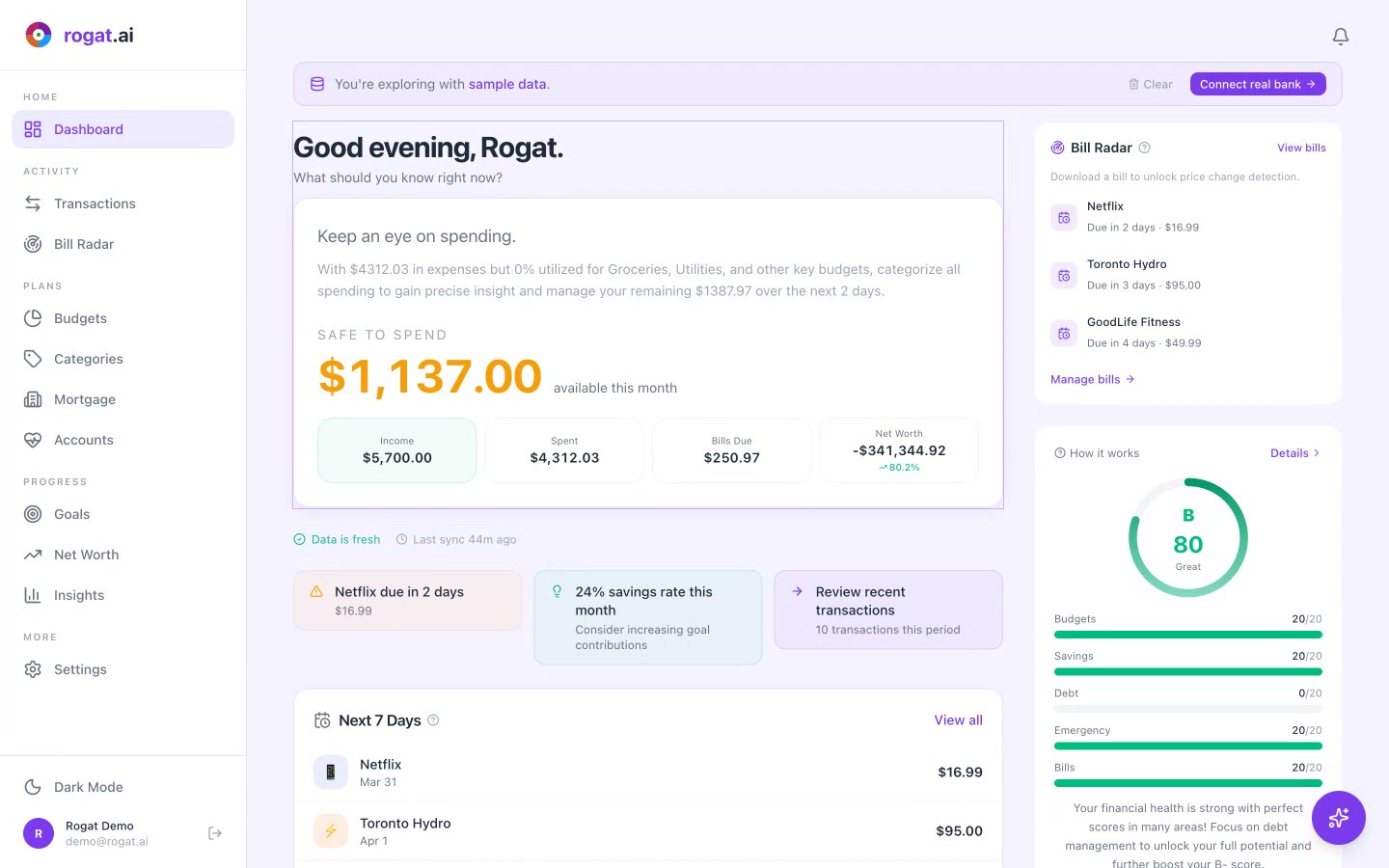
- Income, Spent & Saved — Three key numbers at the top: Income ($5,700.00), Spent ($4,312.03), Saved (24%). The health of your month in three seconds.
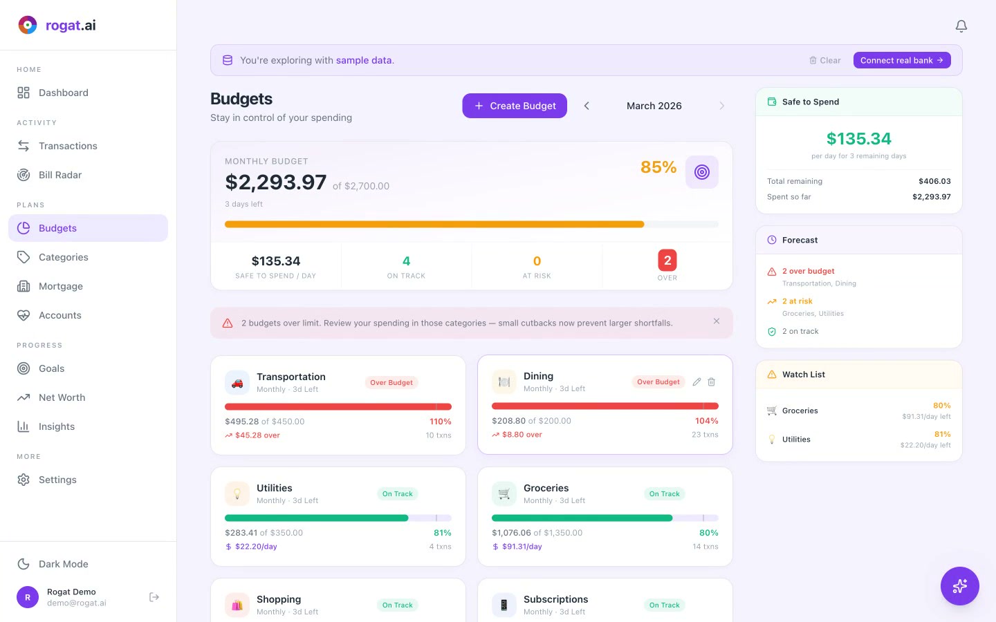
- Spending Breakdown — Pie chart and list by category: Housing ($1,920.00, 45%), Groceries ($1,076.06, 25%), Transportation ($495.28, 11%), Utilities ($283.41, 7%), Dining ($208.80, 5%).
- Top & Lowest Spending — Sidebar showing your biggest category (Housing, $1,920.00) and smallest (Entertainment, $48.07). Know where the money goes.
- 50/30/20 Benchmark — Needs (50%) = $2,850.00, Wants (30%) = $1,710.00, Savings (20%) = $1,140.00. Your savings rate: 24% — exceeding the benchmark.
- Cash Flow — Income ($5,700.00), Expenses ($4,312.03), Net (+$1,387.97). Are you living within your means? This answers it.
- Time Range Selector — Toggle between 1M, 3M, 6M, 1Y, 2Y to spot trends across different periods.
Why It Matters
Numbers alone don't change behavior — stories do. The monthly story feature is what makes Insights different from a typical finance app chart page. When AI tells you "your grocery spending is 25% of expenses and here's how to reduce it," that's infinitely more useful than a pie chart you have to interpret yourself.
The 50/30/20 benchmark gives you a framework to evaluate your spending without judgment. And the time range selector lets you zoom out to see if you're trending in the right direction over months, not just this week.
Tip: Check Insights at the end of each month. The AI story is most valuable when it can compare a full month of data. It's like getting a free financial advisor review — every 30 days.
More Tutorials
Understand Where Your Money Goes
AI-powered insights that tell you what your spending means — not just what it is. Sign up free and get your first monthly story.
Sign Up Free